900 seconds with Emergency HQ
Very quick UX and Game Design Lessons from 15 minutes of "OLD SCHOOL" classic.
Welcome to my Design Breadcrumbs Newsletter - The place dedicated to share insights and notes from UX design and Gaming industry. Please subscribe.
Emergency HQ
Today’s post will be a quick one. Busy days mean less time for games, but let’s do it anyway for the sake of consistency and keeping the habit alive.
Today, I will get to experience one of the “oldies” in the market of mobile games. The Emergency HQ game was originally released in 2017 as a mobile version of their long popular series called Emergency. Even though the game is currently not trending in the top charts, the revenue it generates is stable and the longevity of this project is respectful.
I believe that as designers, we should look for lessons outside of just the top trending charts. This way we can widen the variety of sources for our development and inspiration.
So let’s find out what lessons can we learn from mature projects such as these.
WHY 900 SECONDS?
Anytime I try a new game, I’m a bit worried for myself. If the game is well designed, I can easily spend a lot of time even in the first session.
To keep myself in check, I decided to put a strict timer for just 15 minutes and turn it into an exploration of game design.
The original question was: Can you learn anything insightful by just playing 15 minutes? Always.
So the real question is: What can you learn in just 15 minutes?
Let’s find out today with Emergency HQ. (You can Download the game at AppStore / Google Play )
GAME DESIGN LESSONS
Reminder: Game design (GD) lessons follow the principle of the Design Breadcrumbs newsletter which is to provide easy-to-digest insights.
1. LOADING SCREEN BUILDS THE EXPECTATIONS
Lesson: Think of the Loading Screen as a tool, that can help you set the expectations from your game.
Extra Tip: If your game has a longer loading times and there is nothing you can do to reduce the waiting, consider adding Tips and Hints about your game, so that player always learns something new.
2. There is a market for unique gameplay
Even though the game looks dated in some areas (i.e. User Interfaces and even the Main HQ screen), it still delivers on the gameplay, where it matters most. Every single mission feels unique and not repetitive. The further you progress, the more complex missions you get. Just look at this high-level gameplay, where the mission takes over 8 minutes to complete!
Lesson: Going for niche gameplay is harder than ever in 2023. But if you are not aiming for hundreds of millions of revenue, you can still find a niche, build a loyal community, and develop a unique gaming experience.
My little not-so-secret wish for 2024: Fewer clones and more innovation in the mobile gaming industry, please.
3. In-game “guidebook” available at all times
The Guide has a really STRONG presence in the game’s UI. The colour choice of orange makes it one of the most prominent elements in the HUD along with red pulsing mission screen.
Lesson: Consider how the complexity of your game changes over time. Anytime you move from the casual genre to something more mid-core or hard-coreish, there is a chance there will be some fan Wikipedia out there. If this is the case with your game, consider adding some guide inside, so the players can get help directly and don’t have to abandon your game.
Reminder: Mobile games do not have that comfort of 2+ Screens with many opened Wikipedia tabs running simultaneously with your game.
4. Unit selection and interaction is very-very unclear
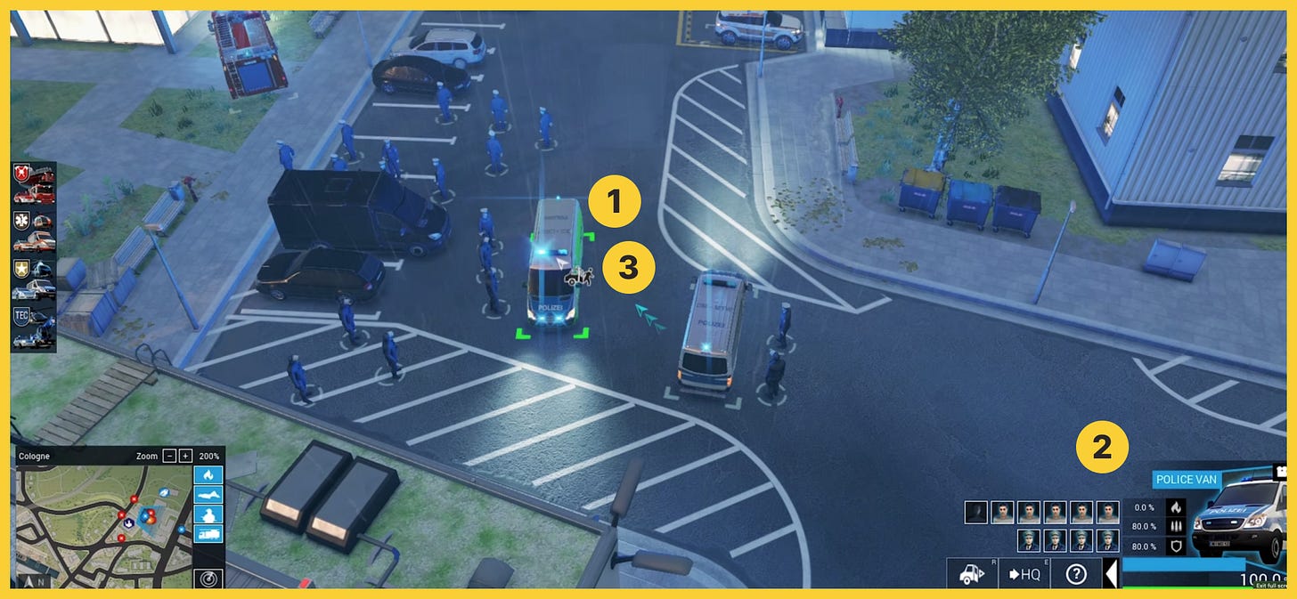
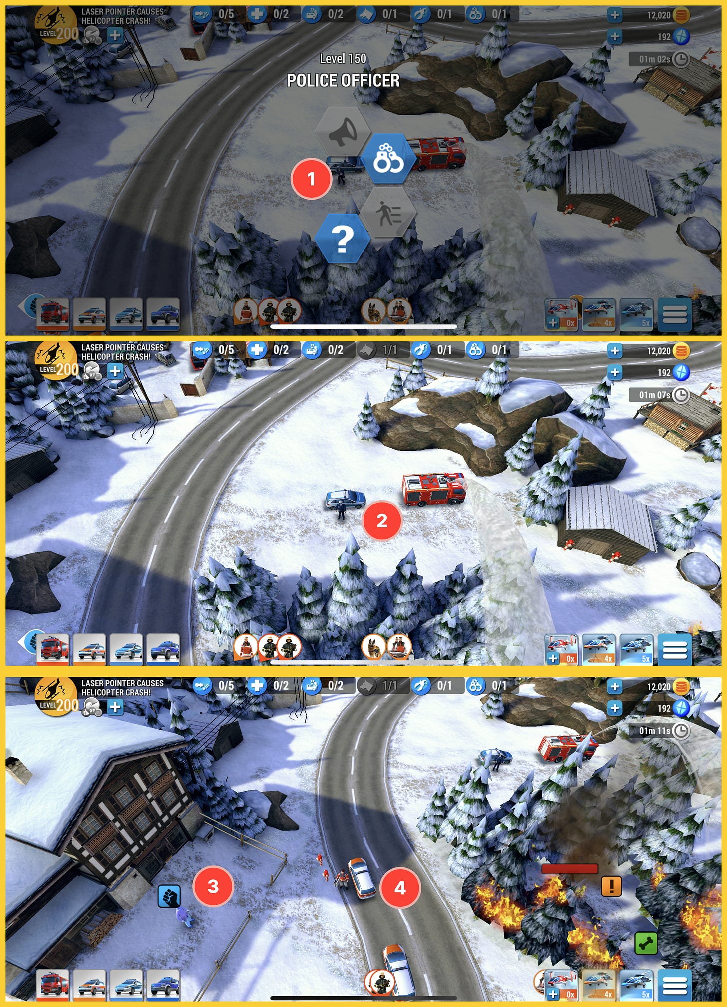
The interaction with the emergency units is not as smooth as on the PC. Once you tap the unit, you don’t have the clear naming of the actions. Then the selected unit is not highlighted and interactive objects with this unit are highlighted with a pulsing glow.
Such glow is in many cases not clearly visible. This might lead to an increase in interaction time and even confusion (which happened to me regularly). This is especially important in the case of an Emergency where literally EVERY SECOND COUNTS.
Below you can find the comparison of Mobile vs PC experience. PC experience is by design more complex than mobile. Despite this fact, the PC game manages to follow more usability heuristics which results in more clear and easy-to-understand design.


Lesson: When going to mobile, you don’t have the luxury of the cursor’s “mouseover” and tooltips. Your options for interactions are also limited to touch. Therefore you need to make extra effort to highlight the elements such as interactive objects, and active objects. And don't forget to fine-tune the touch areas so the miss clicks are eliminated.
Wrap Up
As I mentioned at the beginning, recently I had limited time for gameplay, but I’m happy that I experienced this “oldie” because it felt so different and unique to the other trending games in the current market. The combination of unique missions with the attention to detail in the world is a really lovely recipe. I guess some of these Emergency titles will end up on my Steam Wishlist. That interaction though could seriously use some revamp.


